Woodlead for natural wood products, a that brand takes pride in showcasing the beauty of natural wood. From timeless furniture pieces to functional everyday items, they bring a touch of nature into every corner of your life. Explore the warmth and authenticity of their handcrafted creations, where each piece tells a commitment to the inherent elegance of wood.
The Challenge
Woodlead celebrates natural wood in every form, from timeless furniture to functional everyday items. The core challenge was to distill this essence into a visual language that is both modern and rooted in natural authenticity.
Key Challenges:
01
Translating Nature
Conveying the organic textures and warmth of wood into digital and print visuals.
02
Consistency Across Mediums
Creating an adaptable design system that works seamlessly on everything from business cards to digital platforms.
03
Balancing Tradition with Modernity
Reflecting Woodlead’s rich heritage while appealing to a contemporary audience.
Concept & Inspiration
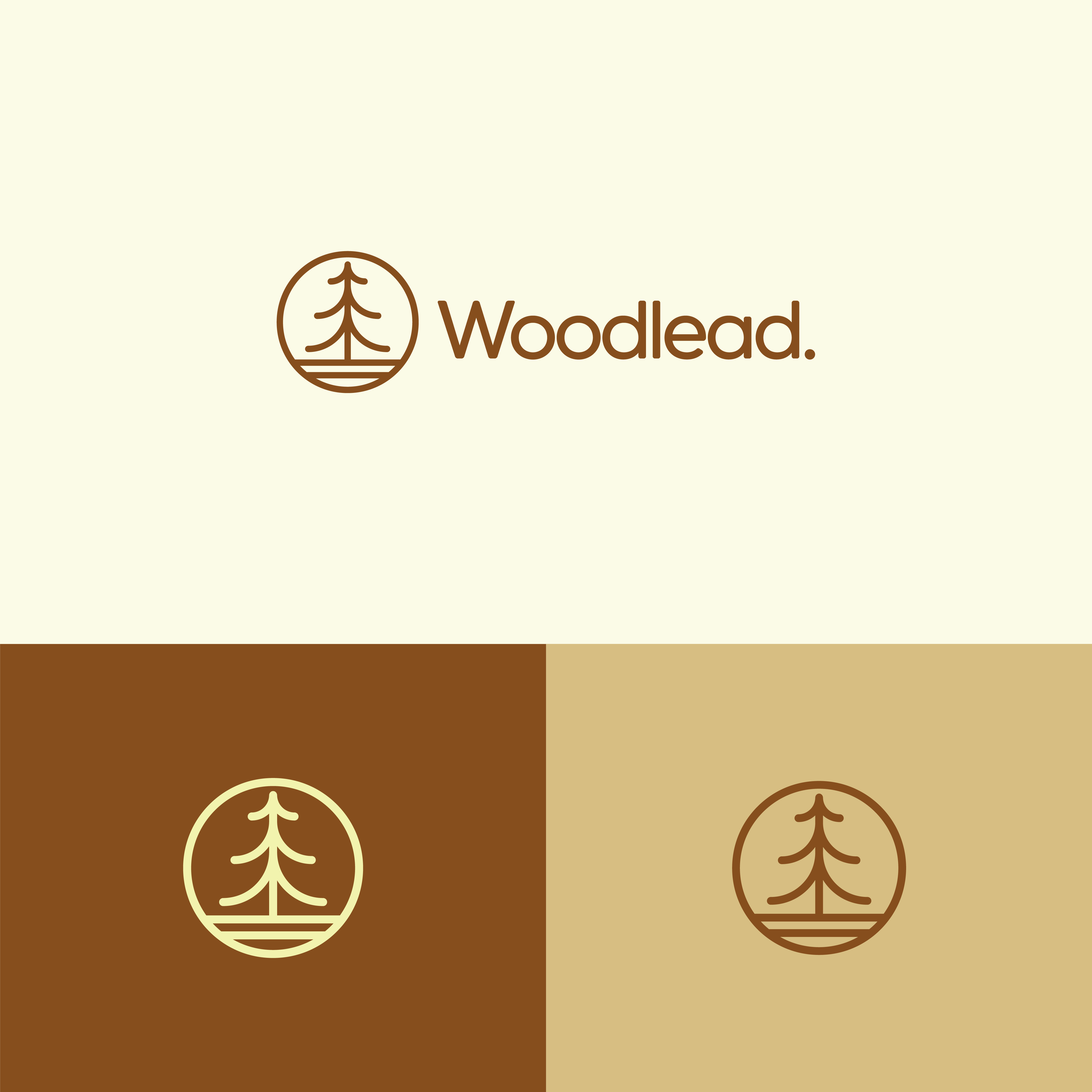
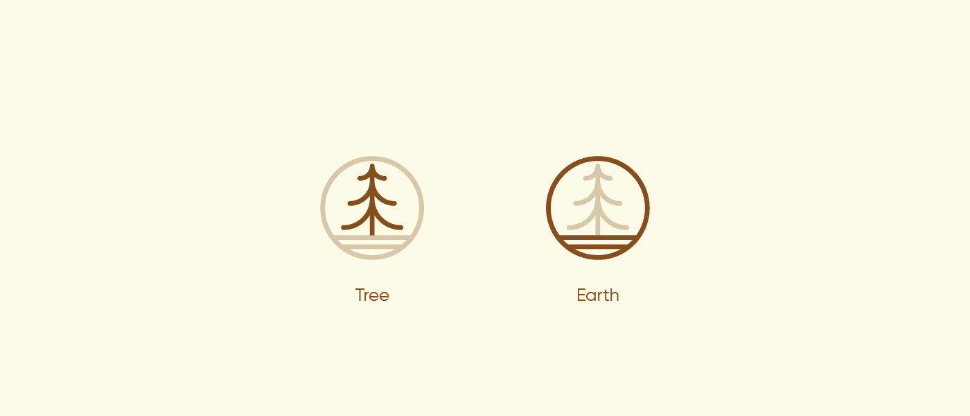
Tree & Earth Symbolism
Tree: Symbolizes growth, life, and the source of natural wood. The minimal, stylized tree within the logo conveys a sense of timeless elegance and simplicity.
Circle/Earth: Represents stability, grounding, and the natural environment from which wood is sourced. By placing the tree inside a circle, the design emphasizes the brand’s respect for the planet and its sustainable approach.
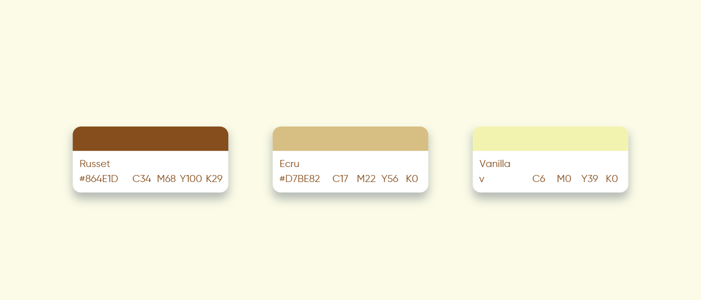
Color Palette
Warm Browns & Beige
Chosen to evoke the organic warmth of wood, these hues tie directly into the brand’s focus on natural materials. They also offer strong contrast and flexibility across various applications, digital or print.
Typography
Clean, Contemporary Font
The wordmark “Woodlead” is set in a rounded, modern typeface that complements the circular logo mark. This pairing maintains a balance between the brand’s artisanal roots and a fresh, modern appeal.
Design Process
01
Initial Sketches
Started with simple pencil drawings to capture the essence of a tree within a grounding element. Explored different ways to integrate the tree silhouette inside a circle.
02
Digital Refinement
Converted the best sketches into digital concepts, fine-tuning line weights, proportions, and negative space to ensure a clear, balanced design.
03
Color & Typography
Tested various earthy palettes and type styles to achieve a cohesive, nature-inspired look that aligns with Woodlead’s values.
Applications
01
Brand Collateral
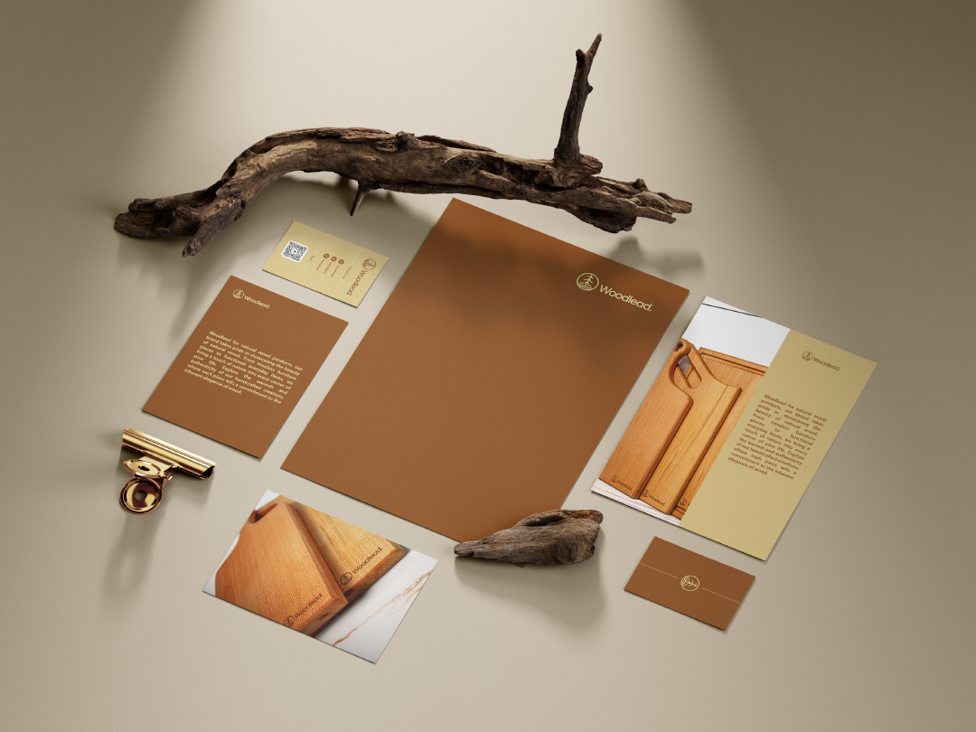
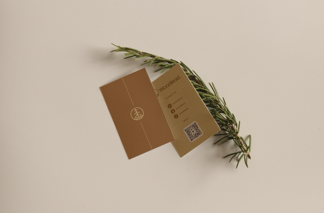
Business cards, letterheads, and packaging utilize the warm color palette and clean typography to reinforce brand consistency.
02
Online Presence
The logo and color scheme translate seamlessly to the website, social media, and digital advertisements, creating a cohesive brand experience.
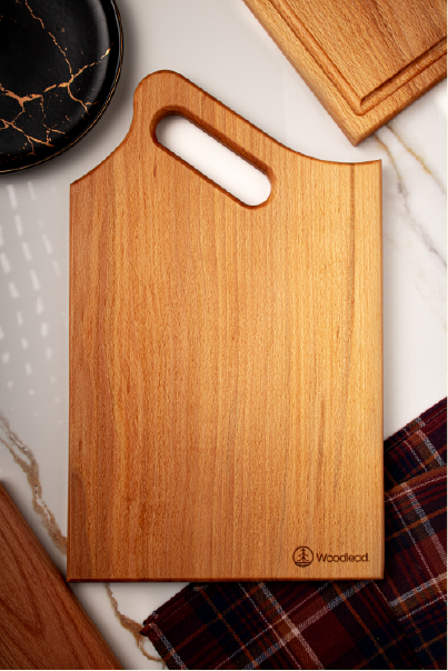
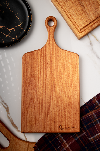
03
Product Labeling
Whether on furniture pieces or smaller everyday items, the minimalistic icon ensures instant brand recognition without overshadowing the products themselves.
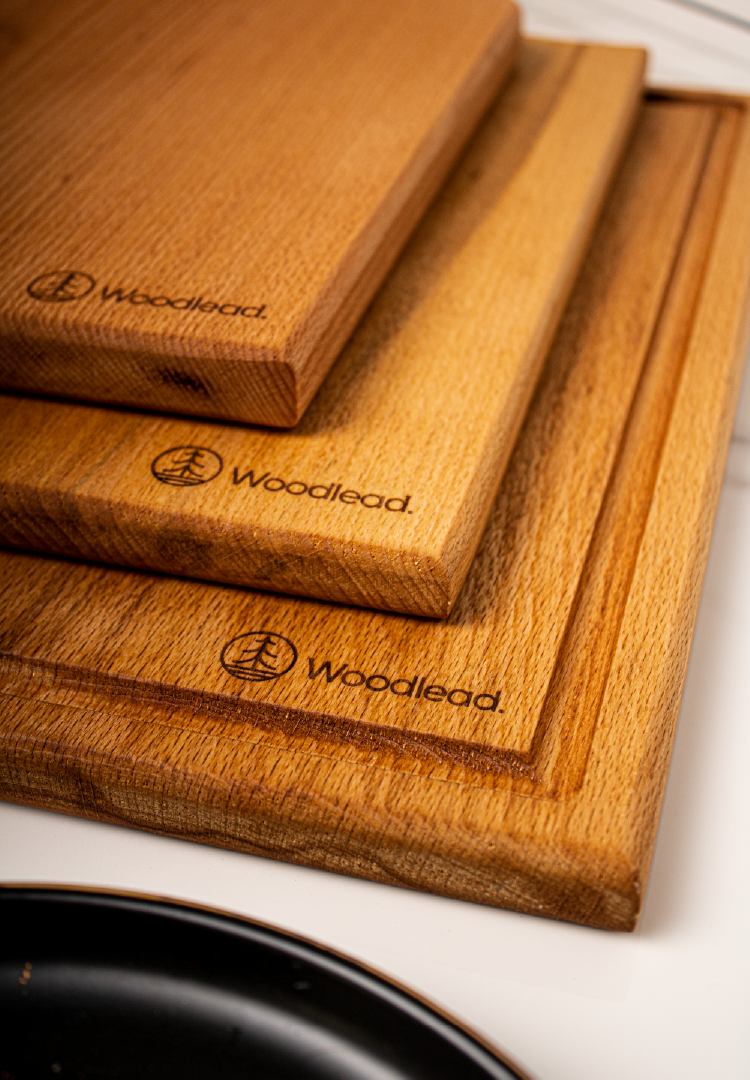
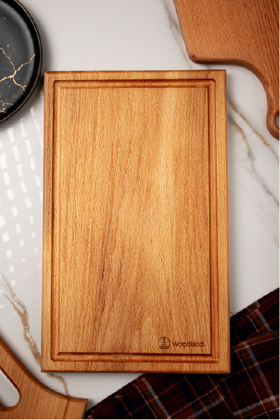
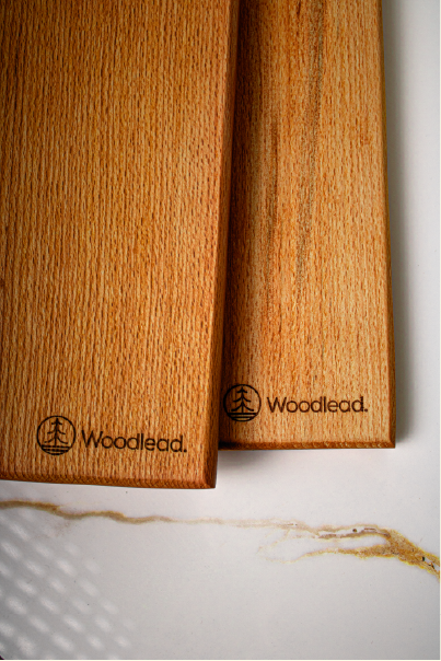
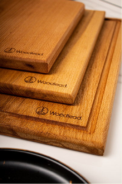
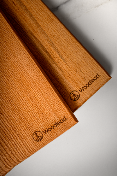
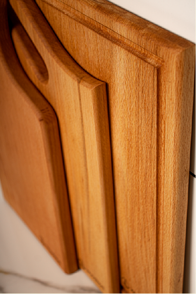
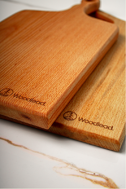
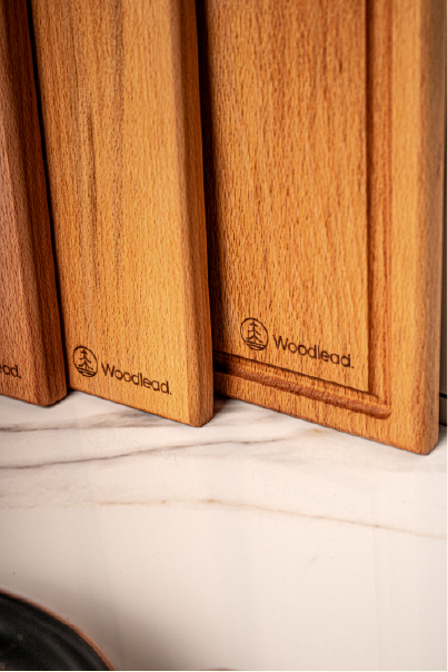
Real Life Product Images
Project Highlights
Minimalist Logo Design
A stylized tree placed within a circular shape, symbolizing the harmony between nature (the tree) and the earth.
Warm, Earthy Color Palette
Browns and beiges that mirror the organic tones of wood, creating a sense of warmth and authenticity.
Versatile Brand Applications
The logo and visual elements adapt seamlessly to packaging, print collateral, and digital platforms.
Sustainable Brand Messaging
The visual identity underscores Woodlead’s commitment to responsible sourcing and eco-friendly practices.
I’m really thrilled with the design work you did for my brand, Woodlead. Your creativity and attention to detail really captured the essence of my woodcraft products.
Achraf Salim Daya
Founder @ Woodlead
Ready to bring your design vision to life?
Let’s create something unique, impactful, and tailored to your brand’s success. Whether you need a bold brand identity, a seamless UI/UX design, engaging social media visuals, or expert design coaching, I’m here to help.