Rosaluxe is a luxury floral brand that specializes in elegantly hand crafted flower arrangements. The goal was to create a refined, sophisticated, and timeless brand identity that reflects luxury, beauty, and exclusivity while staying true to the essence of flowers.
This project required a logo, typography selection, and color palette that would establish brand recognition and emotional connection with its audience.
Project Goals & Objectives
Develop a memorable and high-end brand identity that reflects elegance and exclusivity.
Create a modern yet timeless logo inspired by floral symmetry and luxury aesthetics.
Establish a cohesive brand identity through carefully curated typography and color choices.
Ensure versatility of the logo across print, packaging, and digital platforms.
Design Concept
To capture the essence of luxury and florals, the brand identity was built on:
Logo Design & Symbolism
The logo features a delicate yet bold floral emblem crafted from petal-like geometric elements arranged in perfect symmetry. This represents:
Elegance & Harmony – Inspired by the organic beauty of flowers.
Luxury & High-End Appeal – The intricate design reflects exclusivity.
Timelessness & Balance – A structured, refined approach to branding.
The emblem is complemented by the brand name “Rosaluxe” in a bold, elegant serif font, adding classic sophistication and premium feel.
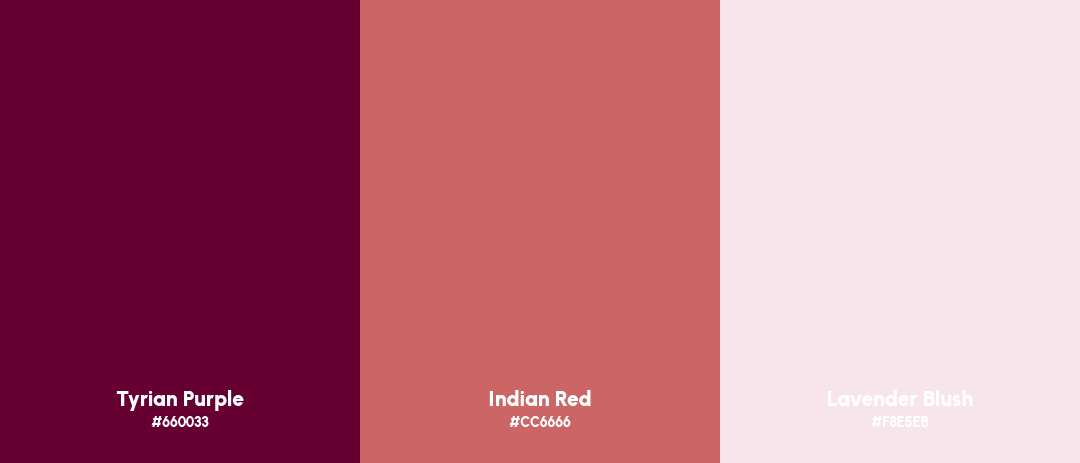
Color Palette
Primary Palette
Tyrian Purple (#660033) – Symbolizes passion, richness, and high-end quality.
Indian Red (#CC6666) – Represents softness, elegance, and romance.
Lavender Blush (#F8E5EB) – Creates a light, luxurious aesthetic.
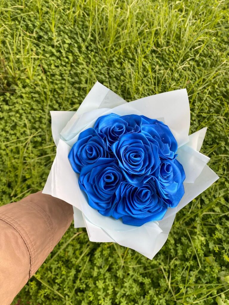
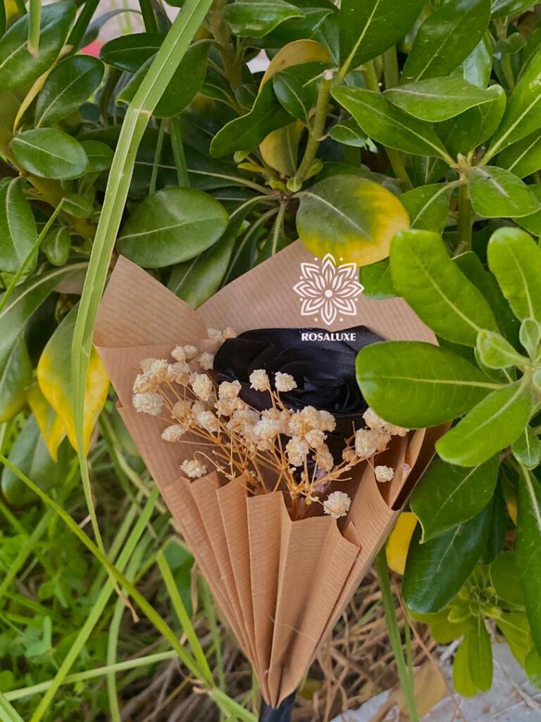
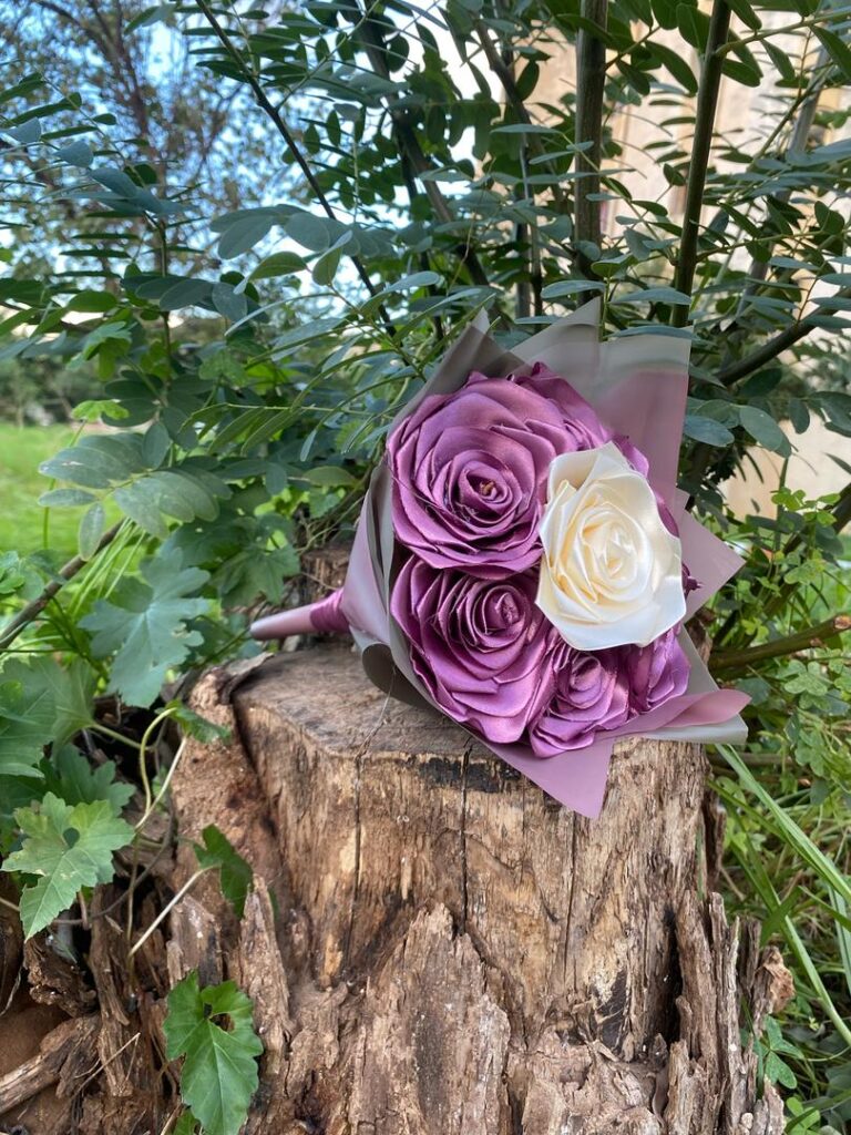
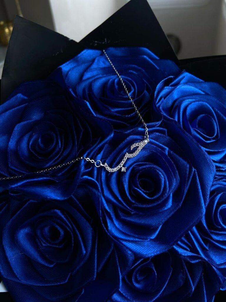
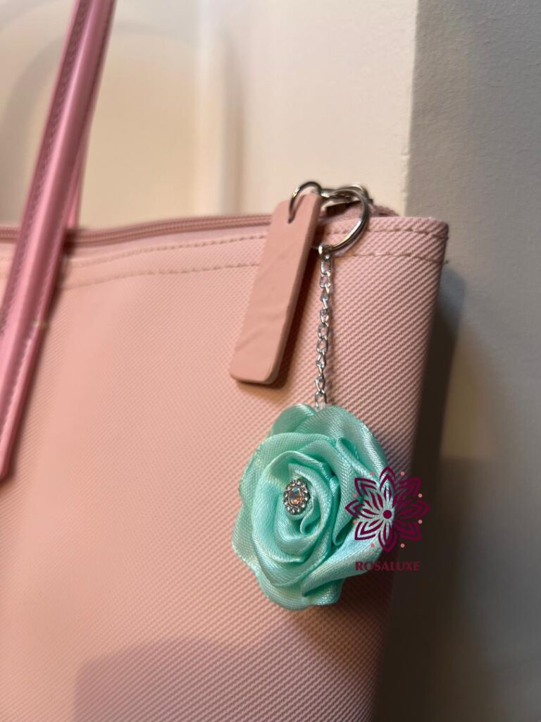
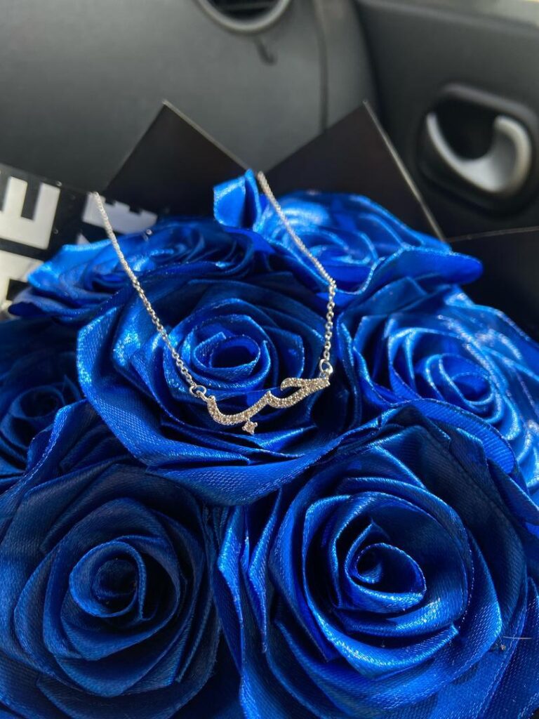
Real Life Product Images
The design you’ve created was impressing, every detail tells a little about my brand, I’m very pleased with the result you came with, it was so nice working with you.
Rania Hennoune
Founder @ Rosaluxe
Ready to bring your design vision to life?
Let’s create something unique, and tailored to your brand’s success.